
Instagram refreshes its identity with a redesigned wordmark after 10 years; Here’s what’s changed
The redesign has sparked mixed reactions across social media, where many are claiming that criticising the “r” letter, saying that it looks more like a ‘z ’.
- Aug 14, 2026,
- Updated Aug 14, 2026 10:20 AM IST
On August 13, Meta-owned social media platform Instagram announced a new text-only version of its logo, which is known as a wordmark. The change comes after 10 years, as the company says the old wordmark started to look dated. Instagram head Adam Mosseri shared a post on Instagram and Threads announcing the change, and described the new text logo as “sharper and more modern.”
“We updated the Instagram wordmark today, which is more than a decade old and felt dated,” Mosseri said. “We feel the refresh is sharper and more modern, but references the original and has the simplicity and craft that's always made it Instagram.”
Must read: WhatsApp may soon let you personalise iPhone chats with animated wallpapers and new chat themes
Instagram’s new wordmark: What changed?
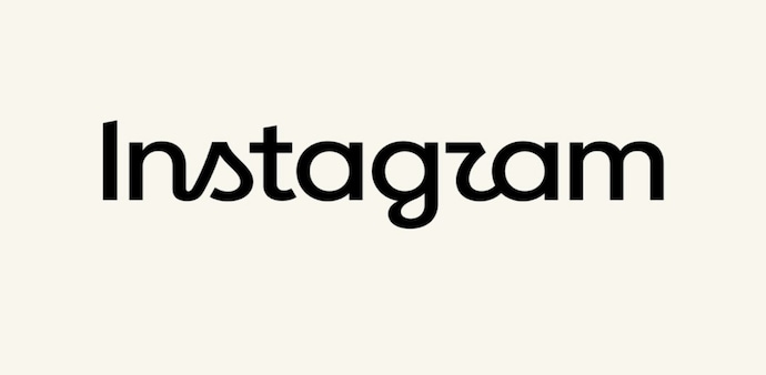
Previously, the Instagram wordmark redesigned in 2016 had a more traditional cursive script. Now, it has been changed to a semi-cursive and semi-print hybrid style, which is said to give a bolder, more compact look and features altered letterforms.
The major changes we can see are around a few letters, specifically "s", "r", and "g". The letterforms were redesigned to give the font a sharper, modernised look. Instagram has also refreshed the broader visual style it uses across its platform, which includes new typefaces like Instagram Sans, Instagram Pen, and Instagram Mono.
Must read: Searching for that one WhatsApp message? iPhone users may soon have an easier way to find it
The redesign has sparked mixed reactions across social media, where many are claiming that criticising the “r” letter, saying that it looks more like a "z". As a result, many have jokingly started to call the platform “Instagzam.” Others pointed out that sharper curves make the logo slightly harder to read at first glance.
Despite the internet's ongoing banter on the new wordmark, Meta maintains that the refined version creates a cohesive, forward-looking identity across all screen sizes and interfaces.
For Unparalleled coverage of India's Businesses and Economy – Subscribe to Business Today Magazine
On August 13, Meta-owned social media platform Instagram announced a new text-only version of its logo, which is known as a wordmark. The change comes after 10 years, as the company says the old wordmark started to look dated. Instagram head Adam Mosseri shared a post on Instagram and Threads announcing the change, and described the new text logo as “sharper and more modern.”
“We updated the Instagram wordmark today, which is more than a decade old and felt dated,” Mosseri said. “We feel the refresh is sharper and more modern, but references the original and has the simplicity and craft that's always made it Instagram.”
Must read: WhatsApp may soon let you personalise iPhone chats with animated wallpapers and new chat themes
Instagram’s new wordmark: What changed?
Previously, the Instagram wordmark redesigned in 2016 had a more traditional cursive script. Now, it has been changed to a semi-cursive and semi-print hybrid style, which is said to give a bolder, more compact look and features altered letterforms.
The major changes we can see are around a few letters, specifically "s", "r", and "g". The letterforms were redesigned to give the font a sharper, modernised look. Instagram has also refreshed the broader visual style it uses across its platform, which includes new typefaces like Instagram Sans, Instagram Pen, and Instagram Mono.
Must read: Searching for that one WhatsApp message? iPhone users may soon have an easier way to find it
The redesign has sparked mixed reactions across social media, where many are claiming that criticising the “r” letter, saying that it looks more like a "z". As a result, many have jokingly started to call the platform “Instagzam.” Others pointed out that sharper curves make the logo slightly harder to read at first glance.
Despite the internet's ongoing banter on the new wordmark, Meta maintains that the refined version creates a cohesive, forward-looking identity across all screen sizes and interfaces.
For Unparalleled coverage of India's Businesses and Economy – Subscribe to Business Today Magazine