
Apple Music redesign drops its signature red look: What’s new in its visual identity?
Apple is reworking the visual identity of its music streaming platform with a new logo, sound-inspired graphics, and an audio signature designed to create a consistent look across its products and experiences.
- Oct 22, 2026,
- Updated Oct 22, 2026 12:51 PM IST
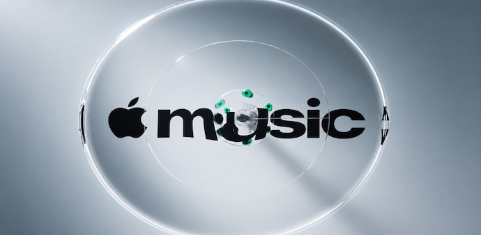
Apple Music is changing how it presents itself to listeners, and the biggest difference may be something you notice before you play a song. The streaming service is moving away from its familiar red branding towards a black-and-white look, with visuals inspired by sound vibrations and Apple’s Liquid Glass design language.
The company has also developed a new audio signature to go with the refreshed identity. While the change may look like a branding update, Apple’s approach goes beyond colours and logos. The company spent months experimenting with ways to turn music into physical movement and use the results to create a visual language for the service. The refreshed identity is expected to appear across Apple Music’s marketing, original content, events and product experiences.
MUST READ | Apple’s iPhone Duo screen has an unusually soft spot near the crease: : Questions raised over materials used
What is different about Apple Music’s new design?
The shift to black and white is accompanied by graphics that draw on ripples, waves and light refractions. Apple is also bringing its Liquid Glass design language into the identity, giving the visuals a glass-like appearance.
According to a report by Gadgets 360, Apple had already previewed its updated wordmark in September while promoting Apple Music Hall, its new live music venue in London. The latest announcement expands on that change, introducing a wider visual and audio identity rather than just a revised logo.
DON'T MISS | Apple caps iPhone Duo orders at 2 per customer as foldable faces delivery delays
How Apple created the sound-inspired visuals
Apple worked with advertising agency TBWAMedia Arts Lab, music producer Fred Again and his collaborator NEST Acoustics to develop the new look. In a YouTube video, the company showed how the team used sound to create physical patterns, then turned them into graphics.
The process involved playing individual musical notes through a transducer, a device that converts audio signals into physical vibrations. The team placed the device in a shallow bath of mineral oil, where the vibrations created ripples and waves. The team filmed these movements and the resulting light refractions to develop the logo and accompanying visuals.
Apple’s Liquid Glass design language, introduced across its software platforms last year with iOS 26, iPadOS 26, watchOS 26 and macOS Tahoe, also informs the refreshed identity. The branding rollout is expected to continue with upcoming software releases, including iOS 27.2 and macOS 27.2. Apple has also introduced a new audio mnemonic, extending the refresh beyond what listeners see to what they hear.
For Unparalleled coverage of India's Businesses and Economy – Subscribe to Business Today Magazine