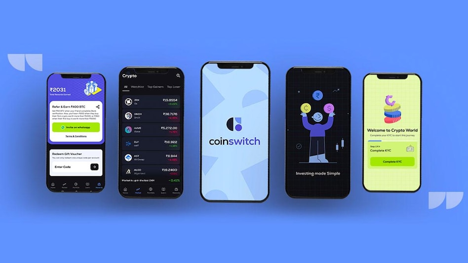
 The app has multiple asset classes with a simple intuitive design by bringing a unified view across the asset classes.
 The app has multiple asset classes with a simple intuitive design by bringing a unified view across the asset classes.
 Cryptocurrency investing app CoinSwitch has revealed a refreshed brand identity, which includes a new logo, colours, font, and a refreshed mobile app. The new app houses multiple asset classes with a simple intuitive design by bringing a unified view. The newly designed mobile app has a content-first approach through bite-sized information, along with visuals, which would help users to make data-backed investment decisions.
The crypto investing app design overhaul flaunts a range of user-friendly sections including a 'portfolio' section that gives a clear view of how the user's investments are performing. There is a dedicated ‘market' section that helps investors in keeping a tab on the price fluctuations. Besides, there a 'learn' section with bite-sized content that helps investors stay updated on all information that's happening in the market in a simple and quick way.
"At CoinSwitch, we want to revolutionise the financial investment journey for Indians. As we transition from a single-asset app to a wealth-tech destination, we understand now more than ever, the need for a stronger relatable visual personality," said Ashish Singhal, Co-founder and CEO, CoinSwitch.
"We want to tell people not just to consume and spend money but to invest money and grow their money. Our new brand identity has taken an approach of no-jargon, bite-sized info, and interesting visuals to aid text. We have also added quizzes and polls where users can apply their learning," said Swati Pincha, Senior Director - Growth, CoinSwitch.
The new design has adopted a soothing mix of colours — the blueish purple, complemented by darker and lighter blue tones juxtaposed with a bold, zesty lime — that articulates the brand’s personality and enhances the visual appeal of the product. The secondary range of warm but bright colours will assist the primary palette.