










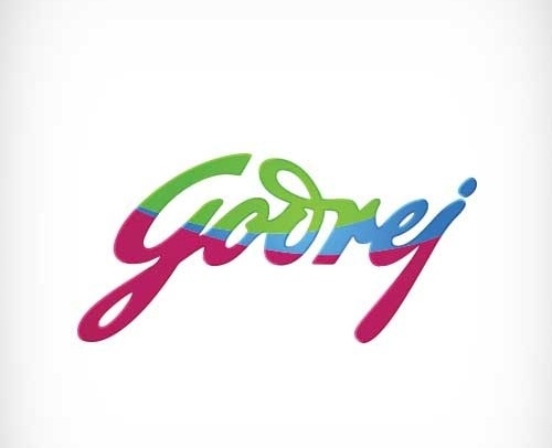



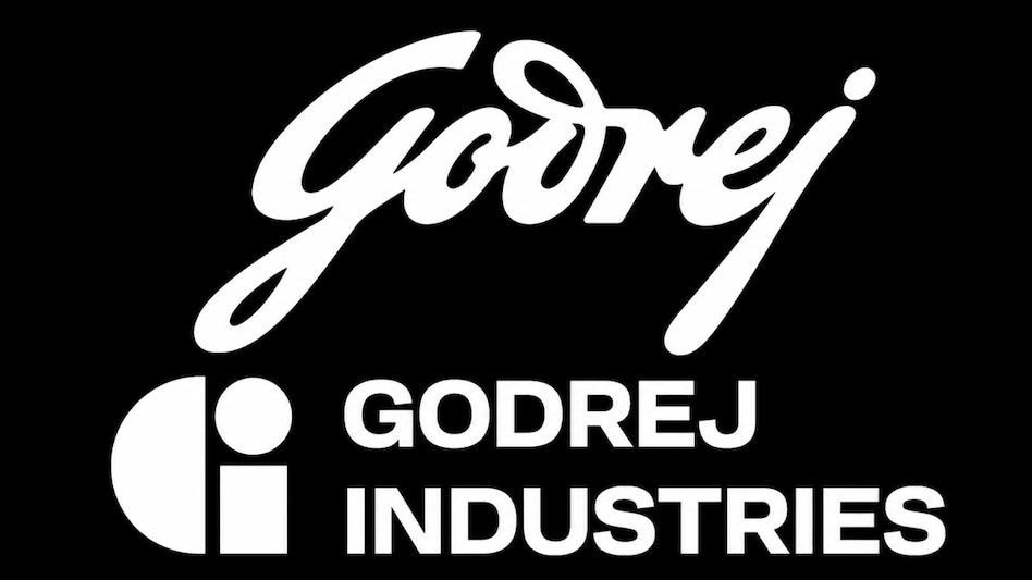
 Godrej group's old logo along with the new logo
The controversy around the new logo unveiled by Godrej Industries Group and its similarity to Guerilla, an integrated agency based in Queensland, has drawn sharp flak from marketing experts. The issue has been playing out on social media with multiple users contending it also resemblance to food brand, iD Fresh.
The unanimous opinion is about the lack of due diligence by Godrej Industries Group, leading to a tricky situation. The iconic signature of its founder, Ardeshir Godrej remains, while the new logo is a part of Godrej Industries Group, the new entity formed after a separation in the family.

 Pezeshkian rejects US nuclear charge, says ‘enrichment’ was an alibi to attack Iran
 RBI rejects Tata Sons’ CIC deregistration bid, makes stock market listing mandatory: Report
 BRICS Summit 2026: PM Modi Hosts Gala Dinner For Putin, World Leaders At Bharat Mandapam
 PM Modi, Xi Jinping stress on ‘strategic and long-term’ India-China ties at BRICS Summit
 BRICS New Delhi Declaration calls for dialogue and multilateralism: All that it saysBRICS Summit 2026: PM Modi Hosts Gala Dinner For Putin, World Leaders At Bharat Mandapam
 BRICS Summit 2026: Mega VIP Move! Ministers, CMs Travel Together In Bus
 PM Modi Proposes BRICS Reform Roadmap, Calls For Global Governance Reset
 PM Modi Proposes 10-Point BRICS Reform Roadmap For Global Governance
 PM Modi, Xi Jinping, Vladimir Putin & BRICS Leaders Explore Bharat Innovates Exhibition In Delhi
 SEBI’s CAS proposals: Expert weighs in on new expiry-day settlement price methodology
 Large caps stocks under pressure as rising US bond yields, crude prices weigh on foreign flows
  SEBI proposes bringing unexecuted Iceberg orders into closing auction
 SEBI proposes new expiry-day settlement formula for derivatives after CAS concerns
 Silver may climb to Rs 3.25 lakh, but January peak looks distant: Navneet Damani
 Ganesh Chaturthi 2026: Wishes, messages, greetings to send to your friends, loved ones
 Japanese, Korean banks see massive EPS upgrades while India lags: Jefferies
 BRICS flags unilateral tariffs, non-tariff measures as trade tensions reshape global economy
 Gujarat passes 'Ease of Doing Business Bill 2026': Shops, malls can stay open 24 hours
 Trump says Iran ‘probably’ behind Saudi oil pipeline attack as West Asia tensions rise